
Scribd: App Intro Refresh
A refresh of the mobile app intro experience for Scribd
Overview
-

Time to launch
• 2 months design
• 1 month development
• 1 month testing -

Team structure
• 1 Designer- Me!
• 1 Engineering manager
• 2 Developers (Android)
• 2 Developers (iOS)
• 2 QA Engineers (Android)
• 2 QA Engineers (iOS) -

Testing methods
• UserTesting
• In product n-way test
Challenge
The app intro is the first interaction a new user has with Scribd. It’s our first, and currently only, time to pitch our product to a prospective user.
We would like to update the current app intro UX. It is outdated both from a design and information standpoint. We desire to give them a refresh to help increase the number of users who create an account and ultimately go on to sign up for a free trial
Why does this project matter to me?
When I worked on this feature, it was rare to be working without a direct product partner, so it was interesting to find my way through this strategy fully on my own. I also spent a lot of time with these screens trying to assess how to improve it in a concise and effective way. The impact of this project is something I am really proud of
Why this project matters to our users
The sign up rate of the previous app intro experience was extremely low considering signing-up is a free action (iOS: 28% of users bounce, and on Android 50% of users bounce.) My hypothesis was that if we could simplify the messaging to reduce fear, we could increase sign-up rate. Helping users feel more at ease fosters a much better emotional state during onboarding
Context
These was the existing app intro screens

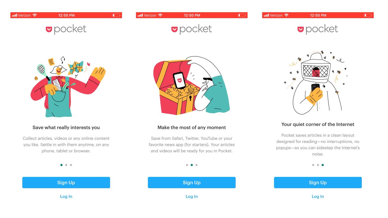
Inspiration
A few of the inspirations I looked at for app intro flows


Initial explorations

Light Touch
Simply put- this was a light touch exploration. I really wanted to implement the 2 CTA’s at the bottom under the theory that “a user should be able to sign up whenever they want without having to finish the app intro”
This also removes the “Free for 30 days. Cancel Anytime” text on each screen

No device inset
this exploration was to try to remove the inset device within a device look of the control screens. Unfortunately, showing UI elements at full screen looks waaaay too interactive

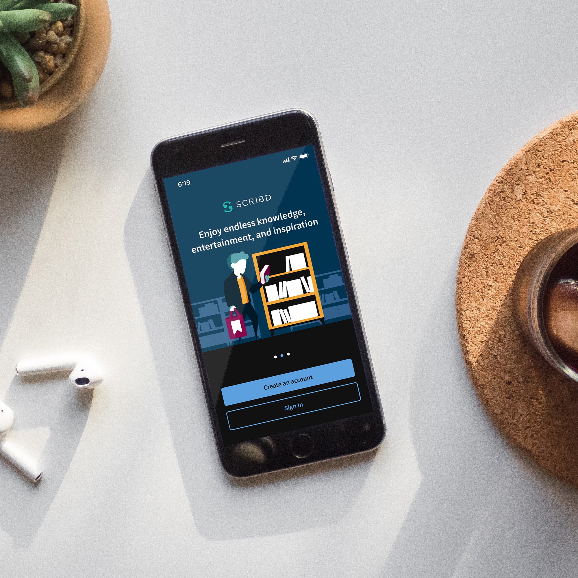
Illustration
Using our brand illustrations helped to make the onboarding experience feel more friendly and this was the direction we moved forward with. Something that started to bother me though was that if we went with this direction we weren’t showing ANY content covers in the intro screens- and if a user wasn’t paying attention in the App Store, they might have even less of an idea of what Scribd is now!
Increasing scope and mid-fi
While the illustration approach tested really well both internally and with users, I had this really ugly feeling about not showing any content thumbnails before the illustration screens to set context for product. I identified that the splash/app loader screen might be a good place to show some content, and repurposed a cover matrix layout style from the “sign up/sign in” screen to populate the splash screen

Final Screens
Light mode

Dark mode

App intro refresh results
Analysis period: 08/04/2021 - 09/08/2021
Total assignments in test: 530K (evenly split across two variants)
iOS
-
+13.8%
Accounts Created
-
+7.8%
Searched within 7 days
-
+8.4%
Viewed a preview page within 7 days
-
+4.1%
Opened content within 7 days
Android
-
+17.5%
Accounts Created
-
+18.8%
Searched within 7 days
-
+19.9%
Viewed a preview page within 7 days
-
+12.4%
Opened content within 7 days